The Zari by L&L Collective
A luxury saree house, designed and launched on Shopify.
A product people normally touch, sold through a screen.
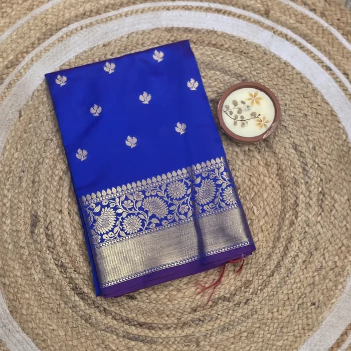
Soft Silk
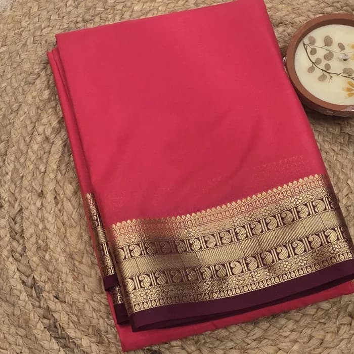
Mysore Crepe Silk
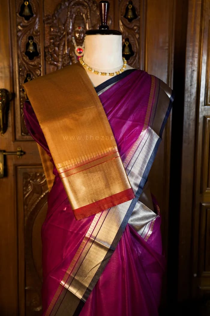
Organza
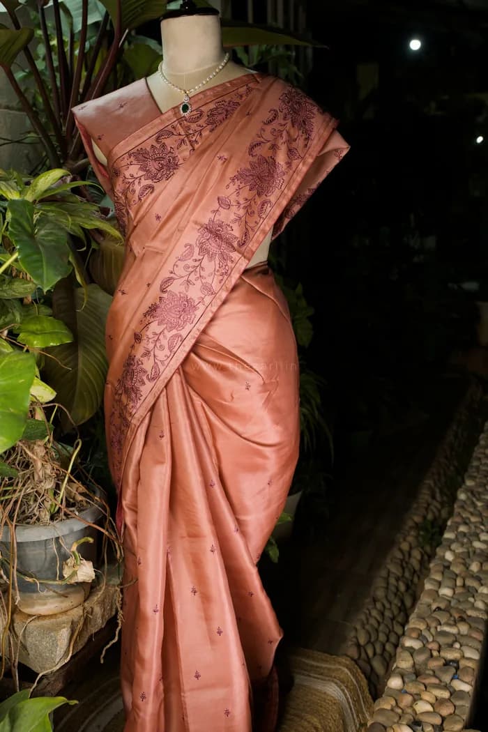
Tussar
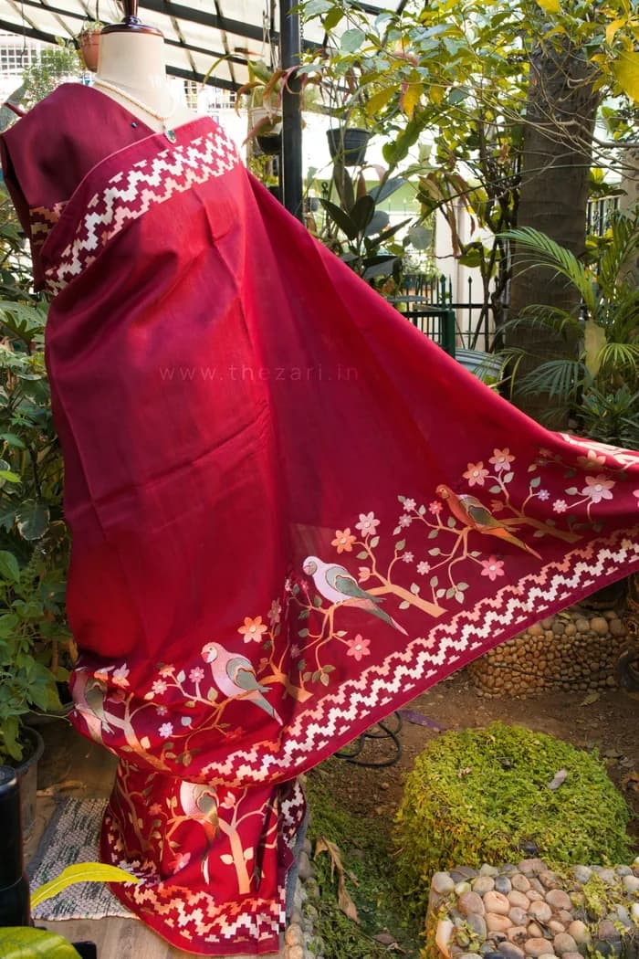
Matka Silk
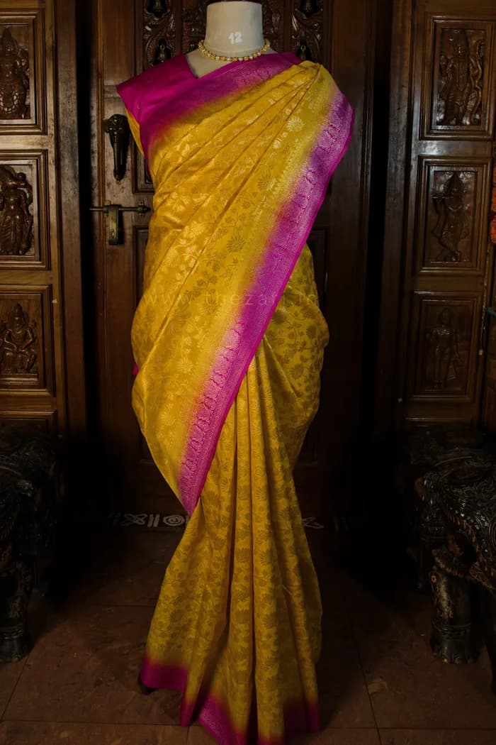
Dolla
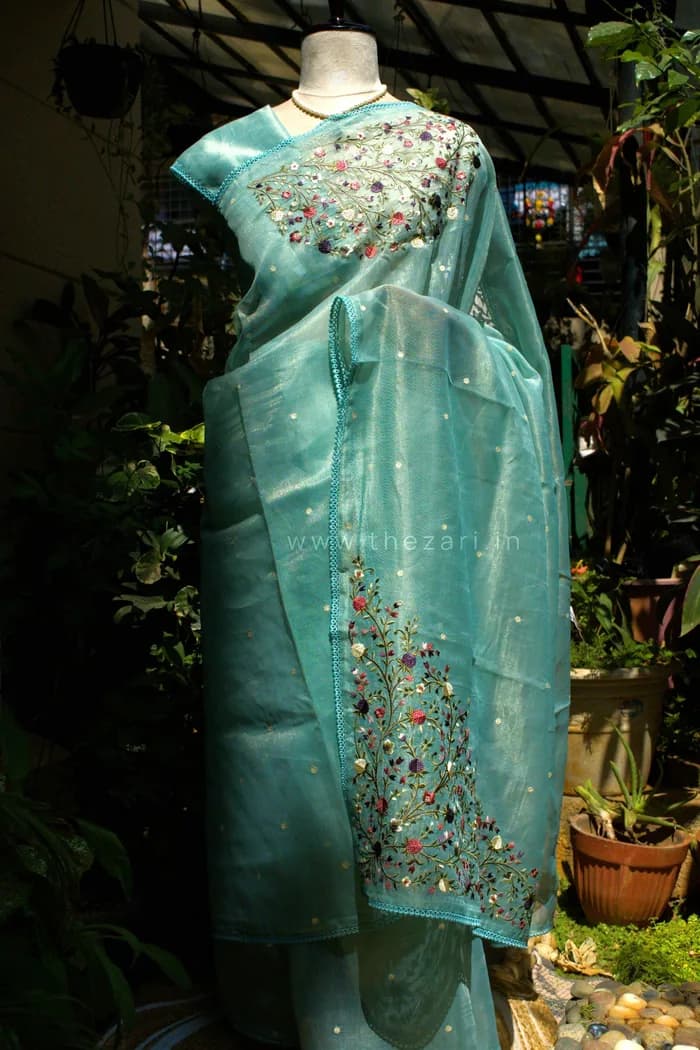
Linen Tissue
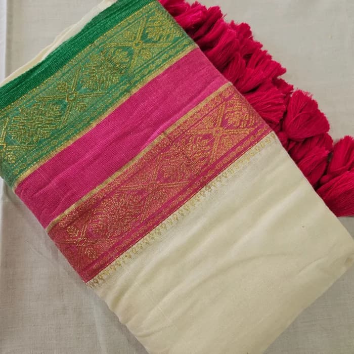
Mul Cotton
The problem
Everything hard about this project comes from one gap: the buying decision is tactile, and the shop is a screen.
What generic ecommerce offers
What a customer actually says
The customer does not start with a SKU. They start with a fabric, an occasion, or a mental image.
How do you sell a tactile product to someone who cannot touch it?
Two steps in the physical version have no digital equivalent at all.
The screen cannot reproduce touch, and pretending otherwise would be dishonest. What the design can do is compensate for the missing layer with visual detail, hierarchy and trust.
Information architecture
Nobody walks into a saree shop asking for SKU 4471. They ask for a Kanchivaram, a Mysore crepe, something in organza for a wedding.
Default ecommerce thinking
All products → sort by newest / price
A grid sorted by a dimension nobody came in thinking about.
How this customer shops
Fabric → collection → saree
The catalogue mirrors the sentence they would say out loud.
Pick a fabric to see what sits behind it on the live store.
All ten collections
One tap from the menu to the fabric someone already had in mind - rather than a single undifferentiated grid sorted by newest or by price.
Soft SilkBlue soft silk saree with a golden border
TL;DRThe catalogue is organised around the sentence a customer would say out loud in a saree shop.
The product page
Four decisions, each solving a problem the customer would otherwise have solved by reaching out and touching it.
A 400px thumbnail flattens the weave, the border and the drape into a coloured rectangle. At that size the customer cannot tell what they are buying, and that objection kills the sale.
Mobile-first
Almost all of this traffic is mobile, and it arrives from Instagram. That is not a responsive-design footnote - it is where the design started.
What the mobile layout prioritises
Desktop was the adaptation. Mobile was the source.
Trust
A first-time buyer is being asked to spend four figures with a brand they have never heard of, on cloth they cannot feel.
When you remove touch, every other signal has to work harder.
It is the trust mechanism. Switch between the two buyers.
“I have never heard of this brand, and I am about to spend four figures on cloth I cannot touch.”
What the checkout offers them
Cash on delivery
Both live in one checkout with no separate flow to maintain. Cash on delivery is not a legacy payment option in this market - it is the trust mechanism for a first-time buyer spending four figures with a brand they have not heard of.
Design to build
A saree shop does not need a bespoke platform. It needs a catalogue that never goes down and a checkout nobody has to trust me to have written correctly.
Understand
How people actually ask for a saree - by fabric, by occasion, by a mental image of a border.
Explore
The wordmark and the zari motif, drawn in Illustrator, as the visual idea the storefront would be built on.
Design
Storefront layouts, the collection grid and the product template in Figma - the phone first, the desktop after.
Build
Dawn as the base, with the hero, collection grid, product template and navigation rewritten against the design.
Hand over
Every field the owners need in the Shopify admin, so restocking never comes back to a developer.
What was kept, and what was rewritten against the design.
What I kept
Cart
Proven behaviour, left alone.
Checkout
Shopify’s own, and not worth reinventing.
Accessibility base
Already tested in the theme.
What I rewrote
Hero
Rewritten against the design.
Collection grid
Rewritten around fabric browsing.
Product template
Rebuilt around detail photography.
Navigation
Rebuilt around the ten collections.
I did not reinvent ecommerce infrastructure to prove I could. I rewrote the sections that decide how the brand and the cloth are experienced.
Design
Figma
Storefront layouts, the product template, the mobile pass
Illustrator
Wordmark and the zari motif that runs through the site
Build
Shopify
Dawn theme, rewritten section by section against the design
The owners are users too
If adding a saree needs a developer, the catalogue goes stale within a month and the store quietly dies.
A bad handover
“Message me when you want to add a saree.”
The actual handover
“Add it yourself.”
No hardcoded copy, no hardcoded products, no theme edit to run a sale. Everything the owners touch is an admin field - which is why the catalogue is still growing long after I handed it over.
Written around the words people actually search.
Brand language
The words a house would like to be described in - and that nobody types into a search box.
Search language
Titles, descriptions and collection pages are written around the fabric names people actually search, rather than around brand language nobody types.
Decisions
Every one of them traded something away. Open a card to see what.
The catalogue is organised by fabric
Ten collections - Kanchivaram, Mysore Silks, Soft Silk, Matka, Tussar, Organza, Dolla, Linen Tissue, Semi Crepe, Mul Cotton. The navigation mirrors the sentence a customer would say out loud in a shop, so browsing needs no translation step.
Photography got the space it needed
Large imagery, generous whitespace and a product template built around detail shots of the border and the zari. The layout is deliberately quiet so the cloth is the loudest thing on the page.
Checkout takes money the way the buyer wants to give it
Online payments for returning and confident buyers, cash on delivery for the first-timers. Both live in one checkout with no separate flow to maintain.
Built on Dawn, then taken apart
Shopify’s Dawn theme gave me a fast, accessible, well-tested base. I rewrote the sections that mattered - hero, collection grid, product template, navigation - against the design.
Designed on the phone first
Almost all of this traffic is mobile, arriving from Instagram. The desktop layout is the adaptation, not the source.
Everything the owners touch is a Shopify admin field
No hardcoded copy, no hardcoded products, no theme edit to run a sale. Adding a saree is uploading photos and filling a form.
Outcome
What shipped, and the gaps I would close first.
A catalogue that keeps growing without me
120+ sarees are live and the owners add to it themselves. Nothing on the content side comes back to me, which is the only real test of whether a handover worked.
Browsing that matches how people shop
Ten fabric collections instead of one undifferentiated grid. A customer who wants a Mysore crepe gets to Mysore crepes in one tap from the menu.
Discoverable by the fabric people search for
Titles, descriptions and collection pages are written around Kanchivaram, Mysore silk and pattu - rather than around brand language nobody types.
Shipping and payment across the country
Delivery across India with both prepaid and cash on delivery, so the store is not limited to the metros where card payment is a given.
I did not build a saree store. I worked out why buying a saree is different.
The client’s own photography, on the store as it shipped.
