A concept redesign of India’s national telemedicine service
The waiting is not going away. So make the waiting do the work.
Before anything else
What this is
An independent concept redesign of India’s national telemedicine service, built end to end.
What it is not
Not commissioned by, affiliated with, or endorsed by eSanjeevani or any government body.
What is real
The product is live and usable end to end - both the patient and the clinician sides.
What is stood in for
The roster and the queue rate are simulated, and sign-in is a PIN rather than a verified number. The product ships a page saying so, linked from every screen.
The person
Before any screen, before any feature - the description that settled every argument on this project.
One phone.
One hand.
Poor connectivity.
Someone is unwell.
Unwell
Every extra step costs someone who has none to spare.
On a mid-range Android
Every font file and every bundle is a real download.
On data that drops
Anything that depends on a session staying alive will fail.
Possibly acting for someone else
One phone covers a son’s fever and a mother’s knee.
Speaks more easily than they read
So speech is the default input, everywhere.
Mixes Hindi and English
Spoken language is tracked separately from interface language.
Has no medical vocabulary
“Loose motions since two days”, not “acute diarrhoea, 48h onset”.
That single description killed more features than any other decision on the project.
They are unwell, on a mid-range Android, on data that drops, possibly acting for someone else in the house. That single sentence killed more features than any other decision on the project.
And often mix Hindi and English mid-sentence. So speech is the default input everywhere, typing is always one tap away, and spoken language is tracked separately from the interface language.
One number is used for a son’s fever, a mother’s knee and one’s own chest pain. Three people, three records, one login - which is why members carry their own health facts rather than sharing the account’s.
People say “loose motions since two days”, not “acute diarrhoea, 48h onset”. The intake had to accept the first and hand the doctor something closer to the second - without inventing anything in between.
The problems
None of these are technology problems. They are all experience problems.
You hold a place in a browser tab. Close it, lose signal, get called away - and your turn can go with it. Meanwhile the waiting itself produces nothing at all.
A doctor opens the call knowing nothing. Three of four minutes go to questions the patient could have answered while waiting - and a patient who is unwell, nervous and on a clock tells the story badly.
Speaking to a doctor you cannot understand is not a degraded consultation. It is not a consultation. Yet language sat in settings rather than in the routing.
A prescription you cannot read, no plan, no follow-up, and a fifth visit that looks exactly like the first because nobody linked them into a course of care.
The big idea
The queue is the one thing the service cannot remove. So the redesign changes what happens inside it.
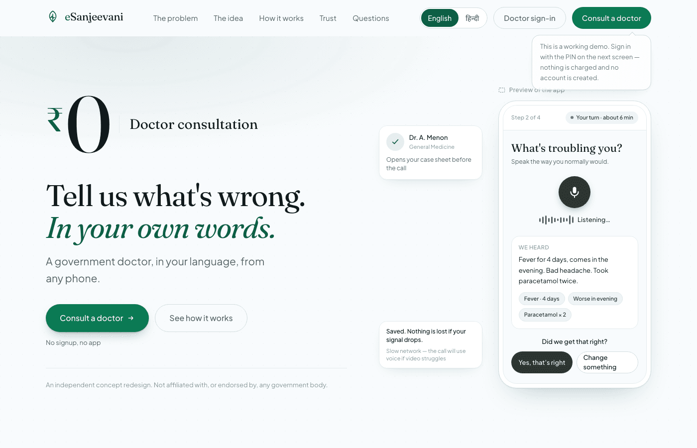
The queue is the one thing the service cannot remove. So it stops being dead time: intake happens during it, and the clinician opens the call with a case sheet instead of a blank screen. The same four minutes of clinician time, spent differently.
The wait should do the work.
The queue is the one thing the service cannot remove, so it stops being dead time. Intake happens during it, and the doctor opens the call with a case sheet instead of a blank screen. Everything else in the product follows from this one decision.
Your place comes from when you joined and how many were ahead of you then. Close the tab, flatten the battery, walk somewhere with signal - the answer is identical. That is the exact failure the real service is known for.
In the routing ladder, a general physician who can understand you sits above a specialist who cannot. It is one line in a rules file and it is the most consequential product decision in the build.
An early version showed the patient their transcript to confirm. It tested as a wall of text somebody unwell will not proofread. It was replaced with the fielded case sheet the doctor will actually see - you confirm the output, not the input.
Every consultation carries a thread id, so four follow-ups are one story. And when a check-in is answered “worse”, that is not filed as an answer - it opens the next consultation on the same thread, with the doctor already holding the history.
No account creation, no appointment picker in the main path, no doctor chooser, no medical questionnaire. Every one of those was cut on the same argument: it asks the user to do work the system can do for them.
The constraint
Step through the actual flow. One of the seven is speaking.
1 of 8
The starting point. No account creation, no appointment picker.
Design constraint
Seven taps from the dashboard to a live consultation, one of which is speaking. No form fields typed, no medical vocabulary required, no appointment chosen. If a change makes it eight, the change is wrong.
This is the rule the build is held to - not a measured usability result.
A screen I had already built, and then deleted.
The thing being confirmed is now the thing the doctor will actually read. One less screen, one less tap - and the intake dropped from eight taps to seven.
Confirm the output, not the input.
Failure states
Every branch keeps what the person has already said. Pick one to see what happens.
What the interface says
The words were saved before the model ran.
What is preserved
The doctor receives the unstructured intake rather than nothing at all.
Every failure branch keeps what the person has already said. There are no dead ends, and nothing says only “something went wrong”.
TL;DRThere are no dead ends, and every failure has words.
Forms submit and validate server-side, filtering is plain links, and language switching is an anchor. The intake completes on a phone that never runs the client bundle.
Permission refused, nothing heard, service unavailable, weak line - each says what happened and what to do instead. A button that does nothing and explains nothing is the worst outcome on a health screen.
And rendered in the reader’s timezone, not the server’s - a bug I shipped and then caught, where a deployed server in UTC told somebody in IST their turn was five and a half hours off.
From date of birth, so a record does not quietly go wrong on a birthday. Under-twos render in months, because “1 year” and “14 months” are different things to a doctor.
All 731 keys come from the dictionary, and the Hindi file is typed against the English one. A missing or renamed key is a build failure, not a blank space somebody notices in production.
One consultation is read by both the patient and the clinician. “Typed or spoken by you” was correct on one screen and a lie on the other - so the fact is stored and each screen writes its own line.
Design
Constraints that keep 24 routes reading as one product on a phone somebody is downloading over 2G.
A solid fill in the action colour means “this is the button”, and appears nowhere else on any screen. Brand green is typographic only - marks, labels, rules. It is the single rule that keeps 24 routes reading as one product.
Every face is a file somebody on 2G downloads. Two sans weights and one serif, and the CSS is written so nothing can quietly ask for a weight that was never loaded.
Its own serif and sans faces, never preloaded so English visitors pay nothing for them. Faux-italic is switched off because slanted Devanagari is simply wrong, and uppercase tracking is off because that convention does not exist there.
Duotone drawings of the literal thing - a browser tab still spinning, a timer with the remaining slice shaded, a page of lines deliberately too dense to read. A row of stock outline icons reads as a toolbar rather than as something to look at.
Navigation sits at the bottom within thumb reach, because the top of a phone screen is the part a single hand cannot get to. Safe areas, keyboard-aware heights and 44px targets throughout.
Scroll-driven reveals with a view timeline - nothing to download, nothing to hydrate, and browsers without the feature render the final state. Content is never trapped behind an animation that did not run.
Spoken and interface language are different things, and one of them affects routing.
Spoken language
What the patient is comfortable speaking - often Hindi and English in the same sentence.
Interface language
What they are comfortable reading. Not necessarily the same thing.
So they are tracked separately
And spoken language sits above speciality in the routing ladder. A general physician who can understand you outranks a specialist who cannot.
Devanagari as a script, not a translation layer
One login, three people, three records.
One phone
One login
A son’s fever
Its own health record
A mother’s knee
Its own health record
One’s own chest pain
Its own health record
A phone is a household, not an account. Members carry their own health facts rather than sharing the account’s - which is a UX decision before it is a data model.
AI
Four narrow jobs, and three things the model is never allowed to do.
Four narrow jobs it does
Each is a separate module with its own prompt and its own validator. There is no general-purpose assistant anywhere in this product.
Three things it is never allowed to do
Enforced in the prompts, and stated in the product as prominently as the capability.
Facts are proposed, never asserted.
Facts are proposed, never asserted. A human confirms before anything enters the record.
So the worst case is an unstructured intake, not a lost one.
The words are stored before the model is called, so the worst case is an unstructured intake rather than a lost one.
Which is why the model choice was a product decision.
For someone unwell and waiting on a screen, latency is a usability property.
Structure the intake, notice lasting health facts, translate clinical text, transcribe speech. Each is a separate module with its own prompt and its own validator - there is no general-purpose assistant anywhere in this product.
Order of operations as a safety property. The transcript is written to the draft first, so a slow or dead model can never cost somebody what they just said - it goes to the doctor unstructured instead.
The case sheet and the routing speciality come back from a single request. Providers cap in-flight calls per account, and asking twice doubles the wait for someone who is unwell. Latency is a usability property here, not a footnote.
Everything passes a shape check with length caps before it reaches application logic. A speciality outside the closed list silently becomes a general physician. A field returned as snake_case is rewritten before a clinician ever sees it.
“I am allergic to penicillin” and “I am not allergic to penicillin” differ by one word, and a model that gets it backwards can kill someone. Extracted facts appear on the patient’s profile as a question, quoting what was actually said, and enter the record only when a person confirms.
Asked to transcribe a quiet room, the model invents plausible clinical speech - I saw it produce symptoms nobody had. So microphone level is measured in the browser and near-silence never leaves the device.
The other side
This was designed as an ecosystem, not as a patient app with an admin screen attached.
Queue
Longest wait first, so nobody is forgotten by being unlucky.
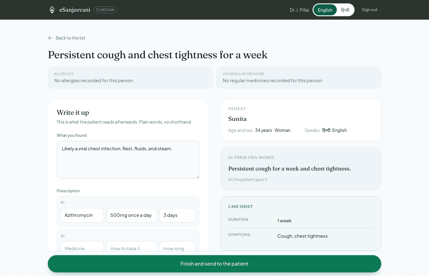
Case sheet beside the write-up
The clinician should not have to remember what they just read.
Allergies and regular medicines pinned
The two things that change a prescription stay on screen.
Prescription cannot be submitted empty
The one mistake that is silent and serious.
Two sides, designed as one product. The patient app is only half of it.
Answer the check-in and see what the product does with it.
“Worse” is not filed as an answer. It opens the next consultation on the same thread, with the doctor already holding the history.
Every consultation carries a thread id, so four follow-ups are one story rather than a pile of visits.
Sign-in, onboarding, dashboard, the three-step intake, queue, call, the record, household members and their health profiles, settings.
A queue ordered by longest wait, the case sheet beside the write-up, allergies and regular medicines pinned above it, and a prescription form that cannot be submitted empty by accident.
Tap-to-start recording, live level metering, server-side transcription, and an auto-advance once the words come back - because somebody unwell should not have to press Continue on their own transcript.
LiveKit rooms scoped to one consultation, ownership checked server-side, tokens that expire in an hour and cannot enable recording. Video drops to voice by itself on a weak line, and says why.
Each side transcribes its own half of the call in 15-second chunks; the server assigns speaker and ordering. A four-section report updates on the clinician’s screen as they talk.
A printable prescription with a verification code, warning signs, and a dated check-in that asks Better / Same / Worse in one tap.
53 doctors across all 35 states and union territories, each speaking three languages. Six-rung ladder, language above speciality, and the record stores why this doctor rather than just which one.
731 dictionary keys in English and Hindi. The Hindi file is typed against the English one, so a missing key is a compile error rather than a blank space on a screen.
Decisions
Open a card to see what would have been simpler, and why I did not do it.
Each one on the same argument: it asks the user to do work the system can do for them.
Account creation in the main path
It asks the user to do work the system can do for them.
An appointment picker
A person who is unwell now should not be scheduling.
A doctor chooser
They have no basis on which to choose, and the ladder does it better.
A medical questionnaire
It demands vocabulary the patient does not have.
An AI “possible conditions” panel
It would have demoed extremely well, and been wrong.
The transcript read-back screen
Somebody unwell will not proofread a paragraph about themselves.
The build
Ten stages, in the order they happened. Pick one.
01
Not “redesign a telemedicine app” but “the waiting is not going away, so make the waiting do the work”. Everything afterwards was measured against that sentence, and several good ideas were cut for failing it.
Each of these exists because of something the user would otherwise feel.
| Technical decision | Product consequence |
|---|---|
| Memory adapter | A reviewer can run the whole product without credentials. |
| AI provider abstraction | The product degrades when an external model is unavailable. |
| LiveKit | Media does not need to pass through my application server. |
| Derived queue position | Closing the tab cannot cost anybody their turn. |
| Speaker from the session | A client cannot put words in a clinician’s mouth on a record. |
Design
Figma
Flows, wireframes, the design system
Front end
Next.js 16
App Router, server components, server actions
React 19
Client islands only where interaction demands it
TypeScript
Strict - the Hindi dictionary is typed against English
Tailwind 4
Design tokens in @theme, no config file
Backend & data
Neon Postgres
Serverless driver, idempotent DDL, no migration step
AI
Kimi (Moonshot)
Case sheet and triage - OpenAI-dialect compatible
Gemini
Speech to text, Hindi in Devanagari
Realtime & hosting
LiveKit (WebRTC)
Video and voice - media never touches my server
Vercel
Deployed, with the database on Neon
What I proved
This is a concept redesign, so these are things the build demonstrates - not clinical or business outcomes.
The same four minutes of clinician time, spent differently.
The honest gaps, in the order I would close them.
The people ahead of you currently clear at a fixed rate, because there is no real roster behind it. The honest version reads live duty state and actual consultation durations - which changes the wait from a countdown into a forecast, and makes the whole "book a time instead" branch load-bearing.
A PIN opens a household today because there is no number to verify in a prototype full of invented people. The swap is contained on purpose: one file goes, the session cookie becomes a signed short-lived token, and no call site changes.
The intake prompt is guarded by a validator, but "did it keep every clinical detail" is currently checked by reading the output. A labelled set of real transcripts with assertions on recall, on refusal to diagnose, and on the denial case - "I am not allergic to penicillin" - would turn prompt changes into something measurable rather than something felt.
The clinician’s in-call notes refresh on a timer, which is right for a demo and wasteful in a clinic. Server-sent events would cut the latency and the request count, and let the report update mid-sentence rather than every few seconds.
Landmarks, focus, contrast and reduced motion are done. What is missing is the harder half: a screen-reader pass on the call controls, a genuinely low-literacy mode, and text-to-speech for the summary - because the person who most needs a doctor is often the least able to read the outcome.
Fifty-three doctors is enough to exercise six rungs. A real deployment has thousands, and the interesting question becomes load: the ladder currently takes the first match rather than balancing across equally valid ones, which would concentrate work on whoever sits earliest in the list.
The follow-up asks Better / Same / Worse and files it. Nothing yet reads those answers back across a course of care, and that is where the clinical value would actually be - a doctor seeing that their last three prescriptions for this thread all came back "same" is the beginning of something useful.
I did not try to remove the wait. I redesigned what happens inside it - and then built the whole thing, both sides, to find out whether the idea survives contact with a real implementation.
