The corporate platform for India’s largest rigid plastic packaging manufacturer
A 45-year-old company changed its name. The website had to change without losing the trust, the search identity, the regulatory information, the usability for buyers, or the client’s ability to run it themselves. I led the scope, the structure, the design direction and the build.
Manjushree Technopack
45 years of coverage, links and citations
MTL
The short form people also search for
Alternicq
The name the company uses now
The user’s problem
Someone searches for a company that no longer exists under that name. They need to know, immediately, that they are in the right place.
The rebrand was not only a visual identity problem. It was an information and discoverability problem.
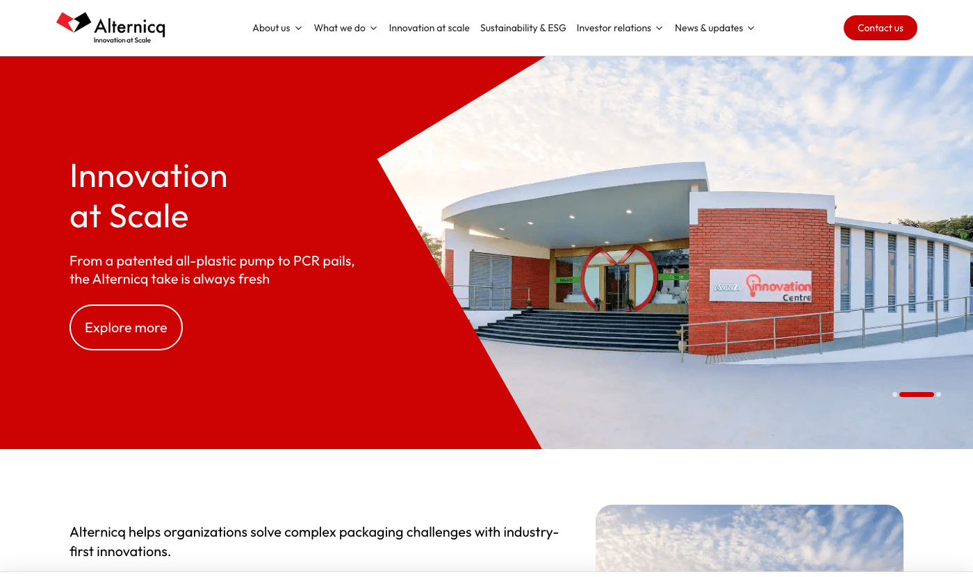
Why this wasn't just a website
Every one of these changed the product, not just the implementation.
Manjushree Technopack became Alternicq. Four decades of press coverage, backlinks and search results point at a name the company no longer uses. Get the launch wrong and the new brand starts from zero while the old one keeps ranking.
Quarterly results, board policies, disclosures, earnings-call notices, corporate governance filings. These are not marketing content - they are documents with legal publication deadlines, and they have to be findable and correctly dated.
Marketing publishes press releases. Investor relations uploads PDFs on a deadline. If either one needs a developer to publish, the site goes stale within a quarter - which is exactly what had happened to the old one.
GoDaddy shared hosting. No Node runtime, no container, no build server, a PHP upload limit measured in single-digit megabytes, and an Apache config that returns a 500 on several of the directives you would normally reach for.
TL;DRThe rebrand was not only a visual identity problem. It was an information and discoverability problem.
What was actually done about it, before launch rather than after.
Organization schema declares Manjushree Technopack and MTL as alternate names, so a search engine or AI assistant resolves all three to one company instead of three.
Capacity, plant count, founding year, patents, certifications and customers are expressed as data an answer engine can quote - not just as sentences in a hero section.
Eight questions written to match what people actually ask about a packaging manufacturer, answered factually enough to be excerpted verbatim.
GPTBot, ClaudeBot, PerplexityBot, GeminiBot and Google-Extended are allowed by name in robots, because being absent from AI answers is now a way to be invisible.
Every route has its own title, description, canonical and OpenGraph tags. Industry and article pages generate theirs from the content they render.
Breadcrumbs everywhere, Product schema on product pages, Service schema on each of the 11 industries, NewsArticle on every post, and a search action on the site itself.
Audiences
Five groups, wanting genuinely different things - two of them on the public site and three of them inside the CMS.
What they came for
Their path
Arrives knowing their industry and their format - not the company’s plant structure.
TL;DRTwo audiences, one site - but they don’t need to navigate the same way.
Information architecture
Not on how the company is organised internally.
What we do
Products
9 product pages
Industries
11 industry pages
Innovation
Company
Sustainability
Investor Relations
13 routes
News
Contact
Buyer path
Investor path
Two audiences, one site - but they don’t need to navigate the same way.
The catalogue reorganised around what a buyer already knows.
How the company is organised
Correct internally, and useless to someone who has never been inside the company.
How a buyer already thinks
Industry: The buyer arrives knowing the market they sell into.
The finder filters on what a buyer actually knows, rather than on the internal product tree.
What a procurement lead needs first, and what can wait.
Buyers scan first. Reading comes second. Every section was structured around that order.
A fundamentally different job from the marketing site.
Marketing
Persuasion is the job.
Investor relations
Retrieval is the job. This section is not marketing and should not read like it.
What the IR section holds
13 routes. Documents are uploaded, dated and categorised by the IR team - scannable in a table, because the person using it came for one specific PDF from one specific quarter.
A procurement lead at a beverage brand and an equity analyst want nothing in common. Rather than average them into one bland structure, the navigation splits early - "what we do" is built for the buyer, "investor relations" for the analyst and the regulator - and neither has to walk through the other.
Internally the company is organised by plant and process. Buyers do not think that way - they arrive knowing their industry and their format. So industries and products became two parallel entry paths into the same catalogue, and the finder filters on what a buyer actually knows.
This section is not marketing and should not read like it. Documents are dated, categorised and scannable in a table, because the person using it arrived to find one specific PDF from one specific quarter - not to be persuaded of anything.
A procurement lead scans: capacity, certifications, client logos, plant map. Those are the first screen. The prose that justifies them sits underneath, for the smaller number of people who read on. Every section was structured around that order.
No gated downloads, no chat widget, no newsletter interstitial. For a manufacturer selling on credibility to enterprise buyers, friction that converts a consumer site reads as amateur here. Scope discipline was as much of the job as scope definition.
Returning visitors were looking for a company that no longer exists under that name. The old identity stays visible and explained rather than scrubbed, so someone who arrives searching for Manjushree Technopack knows immediately they are in the right place.
Design
With 36 routes ahead, the system is what stops the site becoming a pile of pages.
Set before any screen was drawn
36 routes
36 pages that look different
36 routes
One coherent visual language
With 36 routes ahead, a system agreed on day one is the difference between a site and a pile of pages. Approved designs were then specced straight from the Figma file rather than eyeballed, so what shipped matched what the client signed off.
Mobile-first, with elements that genuinely behave differently across them.
375px · Mobile
Elements that behave differently across these
Mobile-first, and tested at all four of these widths.
The CMS is a product too
The backend had its own users, its own jobs and its own interface work - so it is not buried in the engineering section.
Can the client operate the site without me?
| Task | Who does it | Developer needed? |
|---|---|---|
| Publish news | Marketing | No |
| Upload quarterly result | Investor relations | No |
| Add product / spec field | Marketing | No |
| Add plant | Marketing | No |
| Read enquiries | Sales | No |
The default WordPress widgets are gone. The client logs in to an overview, quick actions, products by segment, latest enquiries and recent products - the five things they actually came for. The backend is a product, and its user is a marketing executive on a deadline.
Each section was sorted by who would edit it, and how often.
The client changes this
WordPress content
The client never changes this
Code
It renders faster in code, and cannot be broken by a bad paste.
The content model was designed around the people who maintain the product.
Home, company, leadership, sustainability, innovation, 9 product pages and 11 industry pages - all mobile-first and tested at 375, 768, 1280 and 1440.
13 routes covering disclosures, annual and quarterly reports, presentations, policies, governance, earnings-call events and investor contact. Documents are uploaded, dated and categorised by the IR team.
Products carry segment, technology and material taxonomies. The client can add an entirely new spec field from the WordPress admin and it appears on every product and in the finder - with no code change.
Filter the catalogue by what the buyer actually knows: industry, material, technology, capacity - rather than by the internal product tree.
Blogs, press coverage and events, each with its own listing, category filters, pagination and article pages generated from WordPress.
Locations are content, not a hard-coded SVG. Plants and offices are added in WordPress and the interactive map picks them up.
A validated form with file attachments that stores every enquiry as a record in WordPress and sends a transactional email, so nothing depends on someone watching an inbox.
The default widgets are gone. The client logs in to an overview, quick actions, products by segment, latest enquiries and recent products - the five things they actually came for.
Designed inside the constraint
Taking that as fixed shaped the architecture - and it did not cost the launch date.
The architecture that came out of it
A fast public site with no database and no PHP on the public domain, and a CMS the client can still edit. The constraint shaped the architecture rather than delaying the launch.
A launch-ready site, stopped for one more pass.
What was found
Apache serving an open directory listing over the uploads folder.
A static export never executes the framework’s header configuration - it is just files on disk. Leaving the headers in code would have meant a site that passed every local check and shipped with none of them. They are declared in both places, and the one that actually runs in production is the Apache config.
The textbook fix for a listable folder is one Apache directive - which this host rejects with a 500. So the fix drops a silence file into every folder instead, re-applied nightly, because WordPress creates a new upload folder each month.
The client needed to review the site privately before launch. The gate is an HMAC-signed cookie checked at the edge, with constant-time comparison and a brute-force delay - and it switches itself off entirely when its secret is absent, so launch day was removing an environment variable rather than shipping a code change.
WordPress HTML is rendered into the page, so a compromised editor account is a script-injection path. Every field passes an allow-list sanitiser before it reaches the DOM - an allow-list rather than a block-list, because the list of dangerous things is never finished.
The decision log
A decision without its alternative is just a description.
The process
Ten stages, in the order they happened. Pick one.
01
A packaging manufacturer selling to Coca-Cola, L’Oréal and Nestlé is not selling to consumers. The site’s job is credibility with procurement teams and compliance with the regulator - not conversion. Getting the client to agree on that first is what made every later decision easy.
The result
The headline number is the client’s. The rest is what that number sits on.
| Before | After | |
|---|---|---|
| Updates | A developer was required | The client publishes independently |
| Navigation | The company’s internal organisation | The buyer’s mental model |
| Identity | Manjushree Technopack / MTL | Alternicq, with continuity |
| The thing itself | A static corporate presence | Site, catalogue, finder, IR, CMS and enquiries |
+40%
Enquiries through the site rose 40% after launch
Not from adding conversion furniture - from removing it. Open specifications, a product finder built on what buyers already know, and one unambiguous path to making contact.
Because investor relations shipped in v1 rather than phase two, there was no period of running two sites in parallel and no gap in statutory disclosure.
Marketing, investor relations and sales all work from the WordPress admin. Nothing on the content side comes back to me, which is what keeps the site current after the invoice is paid.
Both the old and new names resolve to one entity in structured data, so 45 years of coverage still leads buyers to the current company.
The pre-launch security pass caught an open directory listing over uploaded files, including CVs sent through the contact form. It never reached production.
Product
UX
Visual design
Engineering
A redesign brief became a platform the client runs themselves.
Understood the business, structured the product, designed the experience, set the visual system, built the front end and the backend, solved the hosting, carried the rebrand across, and handed over a platform the client operates without me.
